The data
This dataset was taken from @zander_venter’s kaggle.com page, titled “Environmental variables for world countries”, although all of the data originally came from remotely sensed data sets available on Google Earth Engine. The majority of values are means from countries taken at ~10km resolution. Accessibility to cities is the travel time to cities in minutes, cropland cover is a percentage of the country’s land, tree canopy cover is a percentage of land covered by trees that are taller than 5m, precipitation is in mm, and temperature is in degrees Celcuis. More information can be found here: https://www.kaggle.com/zanderventer/environmental-variables-for-world-countries/version/4. We’ll be using this dataset to see how these environmental variables are related to continents. To see the code I used in each section click on the Show code option.
Show code
# read in the dataset using a relative path within the project
world_env <- read_csv(here("_posts", "2021-02-05-welcome", "data", "world_env_vars.csv")) %>%
  select(Country, accessibility_to_cities, cropland_cover,
         tree_canopy_cover, rain_mean_annual, temp_annual_range,
         temp_mean_annual, cloudiness) %>% # select the environmental variables we're interested in
  drop_na() %>%  # see some countries (e.g. Antartica) don't have values for variables, so drop those
  mutate(continent = countrycode(sourcevar = Country,
                                 origin = "country.name",
                                 destination = "continent")) %>% # add continent names
  drop_na(continent) # see that some countries are misspelled so we drop those

# make PCA:
env_pca <- world_env %>%
  select(-Country, -continent) %>% # can't have character columns
  scale() %>% # want to scale variables so none will be overly weighted
  prcomp() # run PCA--now it's not a df it's a list with information on the PCA
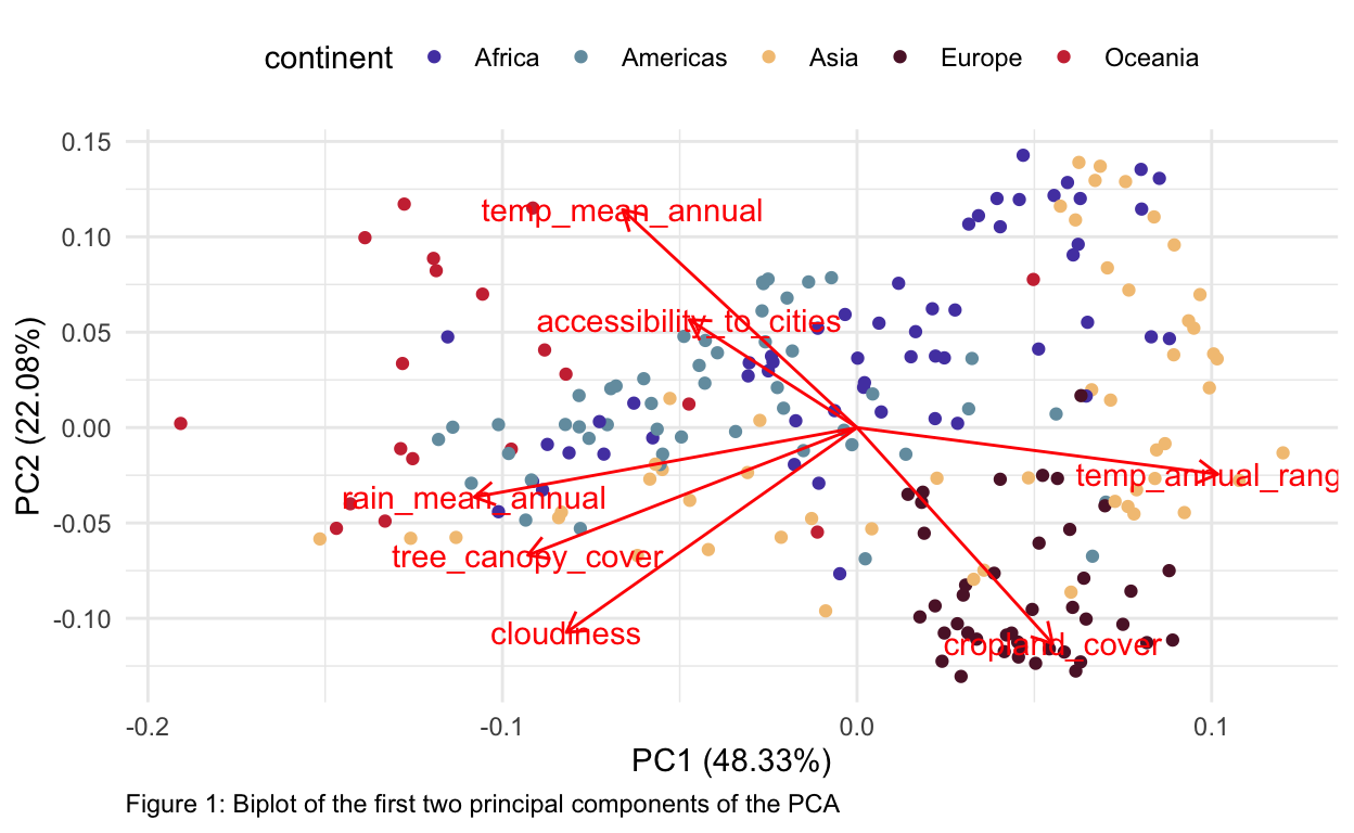
Biplot
Now we’ll plot the results as a biplot.
Show code
autoplot(env_pca,
         data = world_env,
         colour = "continent",
         loadings = TRUE,
         loadings.label = TRUE) +
  scale_color_manual(values = inauguration("inauguration_2021")) + # colors to match the inaugural ladies of the 2021 presidential inauguration
  theme_minimal() +
  theme(legend.position="top", plot.caption = element_text(hjust = 0)) +
  labs(caption = "Figure 1: Biplot of the first two principal components of the PCA")
Interpretation
About 70% of our data was explained in the first two principal components (PC1 and PC2, shown above), which suggests that we’re capturing a good amount of information in just these two dimensions, although keep in mind that ~30% of the variation between continents is still unaccounted for. Europe appeared to cluster together for the most part, but overlapped some with Asia, which was relatively diffuse in PCA-space. Africa and the Americas also overlapped considerably, suggesting they may be hard to classify based on these data alone. Oceana was relatively more distinct, but still overlapped with the Americas. Cropland cover and mean annual temperatures were strongly negatively correlated, perhaps because Europe has a high percentage of crop cover and much lower average temperatures (although perhaps a bigger range) than, say Oceana or Africa that tend to have milder winters and a lower percentage of crop cover. Accessibility to cities and annual mean temperatures were positively correlated, as were mean annual precipitation, tree canopy cover, and cloudiness.